As has been the theme thus far with the hasty relocation of the former Atlanta Thrashers, the logo of the newly transplanted team has been considerably behind schedule. Not that True North Sports and Entertainment has had much of a choice when they acquired the franchise; the original snags and snafus in the relocation negotiations put the new owners behind the clock on everything, from hiring staff to negotiating with players and from establishing the team name (which only finally happened at the Draft, seemingly reluctantly, time essentially having ran out) to designing the logo and jerseys, iconic elements of any team that are sort of important to have before the start of a season.
The jersey design isn't expected any time soon, nor does it have the urgency of the other puzzle pieces, but the logo was considered an ASAP project; the other 29 teams need a logo so they can print tickets for the season, companies like Electronic Arts and Upper Deck need a logo to produce the League's merchandise, the League needs a logo for its own promotional material, and the team needs a logo because augh did the constant use of the generic NHL shield placeholder just get old really fast.
So there were no signals from the organization that the logo would be forthcoming any time soon -- but the early afternoon saw frantic scrambling amidst the Twitterverse and other pockets of the web today when the news broke that the Winnipeg Jets logo might potentially have been leaked.
Could it be true? Had the internet once again worked its information-gathering magic and flushed out the symbol that would guide our beloved hockey team into its new era? Would this be the first public peek at the iconography sure to launch a million jerseys?
It's coming! It's here! It's--
...is that shit glitter? Aw, cripes, that's silver glitter, isn't it. This logo will be the single most important facet of our brand new hockey team's public image, and somebody shoplifted it from the Claire's in the mall. urrrghhhhhhhh
Now, the exact thought process of TNSE after this broke is (as always) a mystery; it may have been that the leak forced their hand, it may have been that an employee broke the street date in the name of street cred, it may have been that the merchandise was already coming and the news only dropped a couple hours earlier than intended.
Knowing the team's ongoing time crunches and how rushed the logo development process apparently was, my running theory is that they'd been pensively waiting to announce the new logo just as soon as the merchandise they'd ordered actually finally physically arrived. "Where are the shirts WHERE ARE THE SHIRTS oh god oh god they said Friday, they told me they'd be here on Friday and we've waited all day for the delivery guy to THEY'RE HERE, THEY'RE HERE oh thank Christ OKAY UPLOAD EVERYTHING TO THE WEBSITE, CALL THE PAPERS, GO GO GO GO GO GO"
Whatever the motivation, the True North ownership group quietly but efficiently made it known to all interested parties that the Winnipeg Jets' new logo would be released on the team's official website at 4:00 PM today. Everybody gathered around at the appointed hour, the F5 keys on several keyboards across the city dying miserable mashy little deaths, and sure enough--
--well, alright. So. Let's talk a bit about what we have here.
First off -- the silver not being glittery is, well, phew, you know? There's a bullet dodged. I was concerned for a while, there. It had been almost impossible to distinguish colours in the leaked shot, but the official concepts confirmed that the Jets' original colours of red, blue and white have all returned -- with silver and/or grey added on top of 'em, but hey, one takes what one can get.
The primary logo is quite specifically based on the Canadian Air Force roundel (the 17 Wing and 1 Canadian Air Division connections to the team and the city are well known, Winnipeg also being where the Canadian Legion was founded). Initially underwhelming, noticeably militaristic, but certainly not offensive or garish -- especially not by NHL standards, the league having seen more than its fair share of ghastly branding misadventures over the years. Ask around with your more hockey-inclined friends and they'll gladly give you a top five worst-logos list, if prompted.
It doesn't stand out immediately, for better or for worse, and that's largely because of its definite similarities to other logos; Toronto fans are currently complaining as we speak about the maple leaf in the center, substituting yellow for silver on that logo essentially yields the Hockey Night in Canada crest, and main or alternate NHL team logos with blue external circles and white centres have become something of a cliche in the past few years. (Blame the Penguins for selling so many of these things.)
And -- in a particularly odd coincidence -- this logo was unveiled on the exact same day as the premiere of Captain America: The First Avenger, and the new Jets logo is sort of a conceptual reshuffling of Captain America's shield. One is red stripes and a blue background around the white American star, the other is blue stripes and a white background around the red Canadian maple leaf. Isn't that kooky? Funny how these things happen.
So the gist of it all is that I wasn't sold on our new Jets logo immediately, but I've come around to it, for reasons I'll be elaborating on a bit later.
My feelings on that secondary mark there, the Captain's wings and maple leaf on a pair of hockey sticks, will depend entirely on how it's used. That design is amazing and perfect for tiny merchandise like a metal lapel pin, perfectly acceptable for a shoulder patch on the jersey or a side logo on the helmet, and staggeringly pedestrian if they decide to use it as the main logo on an away or alternate jersey. The main logo has a certain heft to it, where you can imagine yourself wanting to own something with that logo on it, but ain't nobody going to get excited about wearing the secondary mark here on their chest.
And the wordmarks... well, uh... well. Boy, but they're awkward on there, aren't they? Never mind that the two of them, especially the alternate wordmark, look like we broke into a shed in the Toronto Blue Jays' backyard and stole some of their unused design tweaks. The big problem with these wordmarks is that they don't match the aesthetic of the logos at all; the primary and alternate logo were clearly built around the intention of creating an instantly timeless brand, something that could have been established and could have existed in any era of the game, and then the wordmarks are these jaunty jagged slanty modern flourescent-tube designs. Switch the colours on 'em to shades of orange or red and you have yourself some neon bar signs.
So the first crop of symbols are kind of a mixed bag, but the primary logo -- the most important visual building block of the brand -- is a perfectly serviceable piece that should grow on us all pretty well.
It's also a design obviously intended to appeal across the country and to monetize the Make-It-Seven goodwill; you'll note, besides the obvious pander of the maple leaf, that they chose not to write "Winnipeg" in the blue paint or even anywhere in the logo. They want some dough off this bad boy -- can't blame 'em! -- and since the jerseys are still a ways away yet, True North may as well sell whatever they can get printed as soon as it rolls in.
No time like the present, of course, as the 4:00 launch also saw the arrival of a new advertisement on the right side of the website:
Shown at actual size, mind. So not a huge advertisement; a decent size, equally easy to notice and to not notice if one is accustomed to mentally blocking out the ad spaces on websites. A pretty low-key way to announce the opening of the official Jets store, all things considered, so I suppose the quote-unquote 'grand' opening would likely prove equally low-k--


...well. Never mind.
While we're poking around these pictures, let's have a look inside the store:
We start to get an idea of the colours that might show up on the eventual jerseys, looking around in here. No red merch to be seen, first off; I suppose it's a fair point that there are already quite a few iconic red jerseys around the league, but then, blue jerseys aren't exactly an unknown commodity in the NHL either. (Those team logos I linked above? Blue jerseys all.) It's not immediately obvious if the darker shirts are blue, black, or both, but the logo appears to wear well enough on them.
The lighter blue is an interesting choice, since it doesn't appear anywhere else in the Jets' two logos and only appears briefly in the wordmarks. The combination of red-and-dark-blue logo on powder-blue background might have been intended as a direct callback to the RCAF Flyers, which would be a cool nod to history. On the other hand, we may still just look like all the other teams that tried to grab a ride off the success of the Penguins' baby blues. So... I suppose we'll just have to wait and see what the home jersey's design ultimately look like.
And the logo on white? That one lone white shirt in the window, the combination that apparently isn't for sale? Yo, that looks nice. I hadn't particularly noticed until I saw it hit fabric, but man, that logo just looks swank on white. So to reiterate my earlier point, if they decide that the away jerseys will use the alternate logo, I am just going to be the saddest looking dude you see that day.
And while I'm making unsolicited suggestions for design decisions -- because I know how much they appreciate those! -- there is another and equally important impression that I wish to make upon the organization, if you will allow me this aside.
Dear Winnipeg Jets marketing and merchandising team,
When next developing designs for T-shirts, please start with this --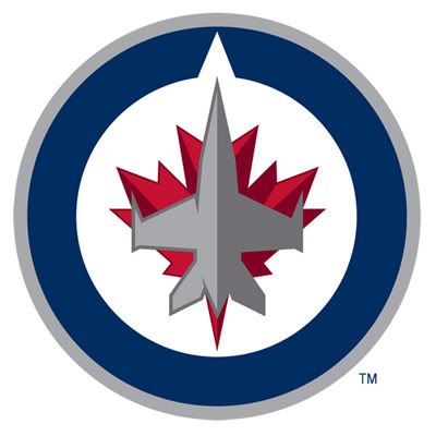
-- and subsequently write the name of the team over it in a font like this.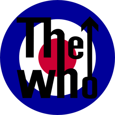
In return, you will receive my money. As much of my money as it takes for me to buy four of them, in case three wear out.
Thank you in advance.
Sincerely,
A guy who wants to give you money.
Now, remember earlier when I said I've come around on the design of the logo? Well, what flipped me to an unreserved Yea vote was a Twitter conversation with Grant Hamilton after the reveal, when he mentioned how amazing the logo would look on a line of military-cut jackets. And it would, wouldn't it? The new Jets logo is at its core a mashup of military iconography, so I suspect it would look pret-ty darn good indeed.
The two of us then also agreed that, really, it would look great on just about any military gear -- backpacks, berets, raincoats, trenchcoats, bomber jackets (especially bomber jackets), what have you -- and that was the exact moment I converted to a fan of the design, that exact second when I realized what a DIY-friendly bonanza we're going to have on our hands once the logo is released as iron-transferable and sewable patches.
You want to talk about the economic spinoff benefits of bringing in an NHL team? Here's one: when those patches drop, I am raiding every army surplus store in the Census Metropolitan Area. The logo taken out of context is visually striking but gives no written tipoffs as to its identity, so anybody unfamiliar with the Jets' new branding will just see this strong, snazzy, hyper-militaristic, hyper-patriotic circle design and think to themselves, "yeah, hey, that's neat. What is that? It kinda looks like Captain America's shield."
And! And. The logo lending itself well to military-style clothing, but not necessarily translating well to standard street wear, means that city teenagers who fancy themselves gangsters but still want to rep their hometown hockey team may all eventually end up dressing like Professor Griff. And that would be amazing, the kind of development that entertains me just by imagining it.
So I, for one, welcome our new logo enthusiastically.
As for the team's inaugural slogan, "Fuelled By Passion":
And that's really all there is to that.
With opening day in September rapidly approaching, there are still a lot of unanswered questions surrounding the team's branding and ambiance. What are they going to do about a mascot? Are they willing to revive and palette-swap the original and long-missing whatever-he-was, Benny, or will they brainstorm a new mascot? And if they do, how do you turn a rigidly jagged militaristic identity into a cuddly, friendly felt giant that will make your birthday or corporate event fun?
What about the arena music and sound effects? Every team in the league has its own designated goal horn, goal music, entrance music, home and away penalty musics, fight music, and anything else they may care to customize. I'm thinking specifically here of those pre-game video packages that teams show on the Jumbotrons before the players come out, because knowing the colours now, I will be absolutely outraged if our team backs those videos with any song other than this one:
And we still don't know what the jerseys will look like. I mean, I'm buying one, I know that, but it'll be nice to know what it is I'm buying eventually.
In conclusion, I dig the new logo quite a bit; the wordmarks put me off, the alternate logo only strikes me as a'ight, and if I had the slogan written on paper I would light it on fire and walk away. But the primary logo? I am looking forward to getting my mitts on the primary logo.
Perhaps you are not; perhaps the new logo is not your cup of tea. And if that be so, I say to you, don't sweat it too much. Mark Chipman and True North spent a decade working within the Vancouver Canucks' organizational chart, and if there's one lasting lesson to be learned from the Vancouver Canucks organization, it is that logos are not permanent or binding in any way. So three years from now, when the team is playing in newly-revised purple and lime jerseys and the logo is a cartoon polar bear posing in a J shape, I hope that you will join me in openly pining for the good old days of our pointy military maple-leaved Steve-Rogers-Hears-The-Who circle.
Until then, sports fans!

4 comments:
Aw geez...we already have Stephen Harper's militaristic wet-dream logo and you wanna amp it up 10 notches and smear it all over a beret and/or army surplus jacket..?!??
If you want to look like a reserve unit in the Serbian militia, sure. Fill your boots.
I guess this can grow on folks, although the Maple Leaf is pandering and I agree on the font choice. Best comment I heard was that the font looks like what every headbanger you sat next to in high school doodled onto his textbook in blue ink...it does kinda jar with the actual logo.
It's not bad but it doesn't soar...which is kinda important for a team named "The Jets", no?
PS - Grant's blog is down, might want to update the link.
While we're on the topic of entrance music, how hard would it be to get True North to consider "Polydor Dance Street - Disc 2 Track 1 (Quick Start Edit)"?
I do think the main logo will look very apropos as a patch, and fit especially well on military-themed clothing like fatigues or berets*, but the more I think about it, the more I'm disappointed by the militaristic theme.
Tyler Shipley, of the Consumer Goods, makes good points about the increasing militarization of both our culture and our sport.
See, for example, his video: "Hockey Night in Afghanada".
I would feel much less unsettled about it if we were still a peacekeeping nation, I suppose.
But also, it just too obvious -- the whole thing.
I'm not saying that I wanted them to pair up with a hot tub manufacturer and go with "Winnipeg Jets - We're Hot" or something.
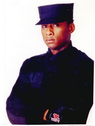
But when I saw the logo, the first thing I thought of was, "Whoa they ripped off this guy."
Although, it's probably not a direct ripoff per se, that just fuels (with passion) my argument that it's obvious.
The logo's okay. I don't hate-hate it. The workdmark's terrible. Like, really terrible.
You're right about the Jays thing -- and to me, the "ts" will look forever like a "w", meaning I'm cheering for the Winnipeg Jew -- but I suspect that workmark gets "refreshed" sooner, rather than later.
... Damn, look at me write. I need to get my blog back sooner, not later.
__
*Colin - have you seen how people wear military-themed jackets? It's irony that's being amped-up, here, I think.
Grant - It's extra-ironic, considering that at least 85% of the populace wouldn't pass an entry-level army physical.
I'd totally cheer for the Winnipeg Jews!
Post a Comment