First things first: now through the end of the week, Winnipeg Art Gallery memberships are 58% off for individuals and 50% off for families on Groupon. Culture at a discount!
(Having just typed that string of words, "Culture at a Discount" seems like it'd be the headline of a national feature on our arts scene. Y'know those weird bi- or tri-annual Globe & Mail articles about how suddenly and surprisingly legitimate Winnipeg is? Well, one of those.)
Hopefully you will find that above link to be useful, and also hopefully -- the two are not connected, mind, please don't feel obligated -- you may be able to aid me with a recent concern of mine. Yes, it's time once again for a little segment that I like to call: Help a Brother Out!
You see, at some point -- surely, at some point, although I do suspect that I've told myself this before -- I need to suck it up and completely revamp the site presentation here. Look at this! Look at all of this, it's a mess. ("I'm a mess!") And the design ain't getting any younger; there have been a few tweaks here and there, sure, but the overall template for this site was set and established in 2006. 2006! What resolution did we even run things on, seven (egads) years ago? All of us just a-squinting away at our 640x480 monitors and our clamshell-ass flip cellphones, and who even knows what else. N-Gages! Dark times. We shall speak no more of them.
(And while the limitations of the template have been simmering at the back of my brain for a very long while, the heat's been much higher on them since MACKSTOPPER; you and I both know that the delivery on that one would have been vastly improved by the derivative actually looking anything like its original.)
These are not new considerations, then, these housecleaning matters, but I think I'm better able to tackle them now than I would have been even a year or two ago. Two things: 1) I've better identified what it is I tend towards, which is longform shenanigans regardless of the subject manner; and 2) online longform finally seems to be hitting its stride, mayhap even approaching something of a renaissance.
I don't know offhand what my all-time longest blog post by wordcount was -- because there's a project I can't be bothered with -- but there've been an awful lot of awfully long posts in my time. I don't immediately recall if I've ever hit the five-thousand mark, but I know for certain that I've gone north of four thousand on more than a few occasions, and if I'm going to expect that of people on a regular basis I should at least make the four thousand and change as easy to read as I can.
And so I've been doing some digging, as late, into the nuances of the medium; I've been primarily ricocheting around Longform and Longreads, but also scouring social media and experimenting with search results.
(This also serves to at least partially explain why it's been so long since my last post: I am not even nearly as good as I'd hoped I would be at ignoring content to focus on layout. "Well, I'm not really sure about the brightness level of this background, but the larger font choice really does help the visibili--wait, what was that Dr. Hook picture just now?")
Just the idea that Longform and Longreads exist -- either of them, never mind both -- would have been strange a year or two ago. It seems that long web reading has, albeit gradually, carved out its own niche on the internet -- not a large one, granted, but bigger than you or I would have expected given the previous prevailing wisdom of how to write for the web.
This too, interestingly, was the result of technological improvements; the previous (and, to be fair, still entirely worthwhile) advice on web writing is/was to cut everything you'd normally write for an offline audience down to one-third or one-quarter its length, because the common standard for print is 300 DPI (is 'DPI' capitalized? I've seen it both ways, remind me to look that up later. Anyway, 'dots per inch') and most screens are/were running at 72 or 96 DPI. So with the human brain accustomed to reading at 300 DPI, it has to work three or four times harder at properly discerning each letter, and thus the reader mentally tires out three or four times faster than he or she does when reading traditional offline print.
The above is me loosely paraphrasing people who are way smarter than me about these things -- citations available on request! -- but you get the point. When the technology for online reading sucked, word counts had to suck along with it. Unless your audience was really dedicated to long stretches of reading, of course, but outside of fanfiction circles -- and please don't ask me why I know so much about fanfiction circles -- you did not often encounter such enthusiasm.
That was then, of course. What a world we live in now! The newest MacBook Pros (which neither you nor I can afford, I know, but stick with me) can run at a resolution of 2880x1800. Your phone has a better screen than your first computer did, and also more megapixels than your first digital camera had. The technology got better, and people started reading in longer stretches, because reading electronically isn't as hard as it used to be.
If you've suspected that I reacted to these developments by laughing a Darrell-Hammond-as-Sean-Connery laugh and announcing aloud that "My time has come!", then, yes. Yes, you are correct, and I fear that you know me too well.
So. Design and layout. You may recall that this was a bit of an internet sensation a couple of months back, and that this blew people's minds when it first dropped. Both deservedly so! They're both pretty neat -- but, then, the New York Times and ESPN do have a bit more in the way of resources than I do. (And also -- I grant that this is purely personal preference, but also -- I am not particularly fond of templates that refuse to show any content at all if you haven't specifically allowed JavaScript permissions for the site. Call me old-fashioned, if you must.)
There are, however, a theoretically infinite number of ways to approach the delivery of longform content online; compare this to this -- both of them centered black text on white backgrounds, but with completely different approaches to embedded images and to sidebar management -- and then compare the both of them to this, which is right-justified (albeit within a centered template) and heavier on images and colour, or to this, which is left-justified with nested videos and a persistent on-brand yellow stripe along the page. Oh, and make sure to do all of that without reading any of the--NO DON'T READ THE WORDS YOU HAVE THINGS TO GET DONE T--all right, fine, see you later I guess
Again, I'm thinking specifically here about the form, not the content; l'awd knows, if I were in this for content I'd insist on reading all of these, and then you would never ever see me again.
So! Help a Brother Out, here -- what do you like, or dislike, in longform reading online? Are there certain formatting decisions you prefer? Sites you lose surprising chunks of time to? A particular page or layout that really locked you into a reading groove? If you've happened, or should happen, upon a longform presentation that really grabbed you, I'd very much like to hear what and why.
Anyway. To crib from George Carlin, these are the thoughts that kept me out of the really good schools. To reward (if 'reward' is the right word here) you for sticking with me through all of that, please enjoy a few pictures of my decor-slash-furniture.
I'd moved into a new apartment at the start of the year (well, okay, a rented condo, because apartments have been hunted nearly to extinction in Winnipeg, but you get what I'm going for here) and not brought a lot of furniture with me, because, well, why would I? My needs are few. Place to sleep, place to work, place to sit, and AS MUCH BOOK STORAGE AS POSSIBLE.
I gotta be me! I gotta be me.
(The building location, itself, straddles two or three neighbourhoods, and all of said neighbourhoods involved have seemed reasonably nice so far; I have not, at any rate, yet encountered any dogs in plastic baby cars.)
However, and I'm sure you more frequent movers are well familiar with this feeling, there are those certain sentimental pieces that are never to be left behind. And I have one such item -- passed down from my father, no less -- that has accompanied me for almost fifteen years now:

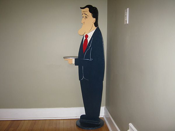
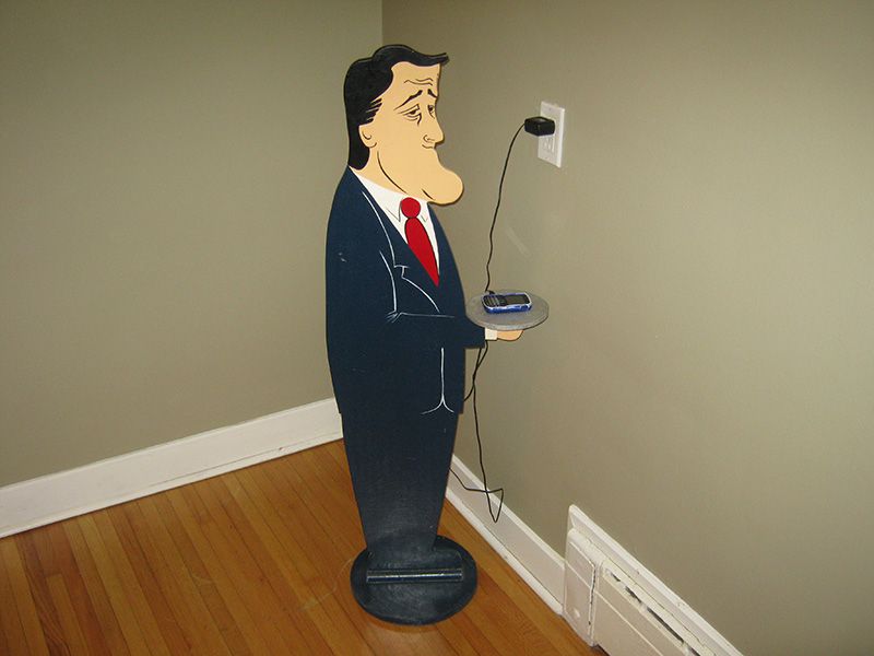
A wooden cutout Brian Mulroney butler standee. Because of course! Because of course.
The origins of this item are lost to time; the first I discovered of it was when my father dragged it out from I DON'T EVEN KNOW WHERE for a yard sale, and as it remained unsold throughout the day I became increasingly insistent that it should fall to me if left unpurchased.
Well, somehow -- somehow; I know, right? -- it went unbought, and I can only imagine what the Greyhound operators must have thought when I checked it in as cargo on the bus back from Brandon. And it has been in my possession ever since, for whatever that says about me.

You can see along the right side where I've had to patch up damage over the years, taking black permanent markers to the 'hair' -- or blue to the 'suit', if necessary -- whenever a chip or dent knocks off some of the original paint.

So, yes. Brian Mulroney charges my cellphone. Your argument is invalid.

What? What the--wait a minute, that's--that's my wallet!
How did -- when did he --
MULRONEYYYYYY
Ahhhh, we do have fun, don't we.
Thank you for reading Help a Brother Out! The wait for the next post won't be nearly as long, so don't think I've forgotten about you folks; I intend to have something up on this site for Valentine's Day, or for Louis Riel Day, or for some combination of both. Until then, true believers!

3 comments:
I read your blog in my RSS reader. It helpfully removes all the formatting.I looked at the actual web page and found that the font was too small to read comfortably and there was a bunch of extra stuff that didn't seem too interesting.
Sorry, that's all I got...
No, no, that's good, that's helpful. That's the kind of feedback I'm looking for.
You're also the second person in two hours to tell me that you follow through RSS rather than the site itself, which is helpful information as well. (Should I find myself uncharacteristically stressing out when working on the redesign, I can just remind myself that many -- potentially most! -- people never actually see the site in the first place.)
Thanks for the input!
Longpost is neato! Stop worry, embrace the Longpost. Also, Mulroney statue for the win.
Post a Comment