You've seen me do this before, and you know how often it happens: I think of some idle curiosity offhand, it rattles around my brain for a week or two until it finally just clamps on, and then I have no choice but to pursue it.
Here's what I'd written on Twitter about a week and a half ago:
Y'know what we, as a city, have just never been very good at? Postcards. They just... they're not a strength of ours. flickr.com/photos/rondowl…
— James Hope Howard (@jameshopehoward) April 2, 2013
And they're not, man. I mean, look at that thing, click that and get a load of it. I kept poking around the related Flickr galleries that day in hopes of finding more dignified recent examples, but, well.
Why?I just, I don't... why.flickr.com/photos/adam79/… #why
— James Hope Howard (@jameshopehoward) April 2, 2013
Now, this ended up getting a bit of a discussion going, and some folks did insist that they'd seen better ones in the wild -- maybe not archived online, like these trainwrecks, but certainly better ones out there somewhere.
Well, it was possible, of course, that I might be wrong; I have been wrong before. Perhaps the local postcards have improved dramatically since I had last checked a physical store; indeed, perhaps each of our postcards are now world-class works of modern art! The days of embarrassing, sometimes cringeworthy photos and colours and fonts could very well be a thing of the distant past, the industry having advanced to a new and higher standard of grace and refinement.
Oh boy!
So curiosity, as it always does, eventually got the better of me, and off I set to discover what our fair city and fair province have for postcard offerings these days. The Forks is an indisputable tourist destination in Winnipeg -- very likely the indisputable tourist destination in Winnipeg, at least for now in our pre-CMHR era -- and thusly that seemed the best place to begin.
 (SORRY GRANT) (in-joke)")
So here we are on the first floor of The Forks, and here is where my earlier bout of postcard-related optimism goes THBPPTH.
It should be noted that, while everything pictured above turns out to be almost universally terrible, not everything pictured above is specifically related to Winnipeg or to Manitoba. As I am a more locally-focused sort, I will be leaving out the postcards sold on behalf of the wider region or the nation as a whole for this post -- although, please be advised that, yes, Canada has some bad postcards.
")
Canada has some really bad postcards.
")
Canada has some really--
")
--GAH. Never mind. You get the idea.
No, for the sake of this exercise, we'll be examining only those postcards that are readily identifiable as Winnipeggian or Manitoban from the front. You'll know them when you see them, because they're the ones that look dated as shit.
")
")
")
")
")
What is, just. What is? I don't. I am mystified.
It took me a long time just to try and figure out, like, are these all actually new and just printed to look incredibly old on purpose, or are they just legitimately that old? Are these being actively produced right now, specifically crafted in a 'timeless' vein, to tap into a perceived wave of retro-aesthetic vintage sensibilities? Or did the stores buy a literal truckload of these some twenty-odd years ago and then just never, ever ran out?
One clue, perhaps, lies in the supplier information on the backs of the cards. Many of them are credited to an "Alex Wilson Publications", out of Dryden, Ontario, and "Alex Wilson Publications" -- at least under that name -- kiiiiiinda doesn't exist any more. The company is now "AWCL Printing" -- there's no telling how long it's been since that name change -- and their website doesn't actually list postcards as a product, finding no fewer than nine other printable items to feature instead. Though it does mention that they were one of Canada's leading postcard manufacturers... in the 1950s, so... well. Never mind, then.
Similarly, many of the postcards are credited to "Henry Kalen Ltd."; while you can still find some listings for the company name, the eponymous Henry Kalen died almost a decade ago, and his ever-popular photography books are confirmed to be going out of print. Do you know many companies who abandon book publishing to focus on postcard production? Not many, right? This does not seem to suggest that the postcards are a continuing venture.
As well, many of the Kalen postcards credit the printing to a "Lawson Graphics Pacific Ltd." of Vancouver, and that company appears to exist only in archival records. Some of the Kalen postcards and some of the Wilson postcards credit the distribution to a "G. G. Picture View Co., 415 Mulvey Ave. E., Winnipeg, Man."; Google the company name and you'll find nothing, Google the address and you'll find everything but the company name.
It is safe to conclude, then, that a great number of the Winnipeg-slash-Manitoba postcards being sold -- being sold right now! -- are not 'retro-inspired', or 'vintage-themed', or 'nostalgia-tinged', or however else one might market them. They're just old. They're old! They are olllllld.
(Tourist-y fridge magnets, however, are a different beast entirely. I'll get to those in a moment.)
In fairness, now, not all of these are awful, exactly; a few of them have their certain charm to them, dated though that charm may be, and manage to avoid completely spiking that charm into the ground with ghastly faux-handwritten font in gradient neon mauve or whatever the hell.
")
")
")
I think I actually like that last one just because of how specifically impossible it is to get away with design like that today. So ostentatious! A product of its time, whatever the hell time that may have been.
Other cards, however, should have known better even then:
")
Ecchh. Not your best work, unidentified font-selector person.
This postcard is also funny to me because I like imagining how long it took the photographer to find a statue that the company could actually print.
"Okay, Hank, wha'dya got from the Park?"
"I've got a sculpture picture here of the disembodied head of an old man, just floatin' around."
"What else you got?"
"A statue of a naked twelve-year-old girl washing herself."
"Uh... no, we'll pass on that one. What else?"
"A naked woman on her knees, wincing."
"No."
"A naked young girl with twin pigtails sitting on a tree stump?"
"Absolutely not."
"Okay, uh--a naked, freshly-pubescent girl riding a bull's head?"
". . ."
"Oh! And here's a couple shots of the prophet Moses, except he looks kinda like a California Raisin."
"'Freshly-pubescent'?"
"LEO MOL IS SUPER CREEPY, OKAY"
")
And then this, this one, this honestly blew my mind a little bit. Make sense of this one for me, please.
If you're wondering what explanation is included on the opposite side, the top-left corner of the back reads "Winnipeg" in large letters, and the bottom-left contains this descriptive text reproduced below in full:
"The International Peace Garden is a park located on the international border between Canada and the United States."
And that's IT. That's the whole of it. I don't even know what to--I just--well, anyway. Best to move on.
")
There are a lot of postcards, with slightly varying displays, dedicated to this statue, because it's the only way they can legally reference the Winnipeg connection to Winnie-the-Pooh without either paying out the nose or getting OBLITERATED in court.
Still, the statue -- and this postcard -- help reinforce the common knowledge that all bears are basically just waiting around to become humanity's cuddly friends. This is not actually true, mind you, but it is considered common knowledge around here nonetheless.
Winnie-the-Pooh is named for Winnipeg! We have so little else to cling to! Everyone, tell the world!
And now, here, as a counterpoint, is a pair of fridge magnets.
")
Winnipeg, Manitoba, Canada: you will be mauled by bears.
PLEASE MAKOON NO
Okay, so, can we just -- can we talk about the magnets, for a minute? Because the magnets are genuinely terrible enough that they actually gave me a crisis of confidence.
")
")
")
Dear me, no. What on earth.
The font and design similarities to our worst postcards are, it would seem, not coincidental; there is a company out there that continues to churn these out, on any item available, inflicting the same pox on magnets as it does on postcards and placemats and who knows what all else. Magnets, it would seem, are kept more current than postcards, perhaps indicating that the latter is a dying market; people can send images and short notes to their faraway friends with much greater ease now than ever before, but the science of sticking things to your icebox hasn't really changed much as late.
")
Esplanade Riel magnets are most definitely a thing now, for example, whereas on the postcard front they haven't seemed t--
")
...ex...excuse me? Can we just zoom in on that middle design, there? I want everybody to get the full experience of that one.
")
I don't think you understand: this was going to be MY EXACT, ACTUAL JOKE. THIS EXACT LAYOUT. A photograph of the Esplanade Riel, some hideous overlay of purple and orange, and two fonts of differing styles and colours, including one in bullshit '90s fake-cursive. It would have been the perfect pastiche of our postcards, and I can't do it comedically, because SOMEONE DID IT SERIOUSLY.
GAH
Other items of interest in Two Rivers, the first-floor souvenir store at the Forks:
")
'Official' Winnipeg mosquito traps!
")
'Official Bird' mosquito lanyards!
")
A bejeweled t-shirt of a silhouetted coyote howling at the moon from a rock cliff, because Winnipeg!
")
A postcard, in mug form!
")
Golden Boy shot glasses, which are actually among the best-designed merchandise in the room!
")
The perfect Manitoba sticker for your Lisa Frank binder!
And, of course--
")
--of course, uh, of...
Huh.
But the most notable display, for our purposes, is:
")
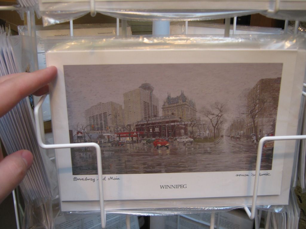
There are a lot of five-dollar-or-more 'postcards' floating around various sections of the Forks -- featuring fancy paintings (which are still super gloomy, because Winnipeg), or sporting traditional aboriginal artwork, or just serving as hilariously oversized Christmas-style folding cards -- but these are the only higher-end cards that are actually worth your time. For one thing, as you can see, they are actually good-looking cards; for another thing, they are made of wood. Thin, mailable Eastern Red Cedar postcards, with classy (by postcard standards) designs and sensible (by postcard standards) fonts, each individual card given additional character by the distinctive grain of its original piece.
Now, if only they'd had someone proofread the backs first. Sample text from the back, [sic]: "The Forks so named because of it's position where the Assiniboine River flows into the Red River." Yes, that's a standalone sentence. (Some other text on the back does insist that "[i]mperfections are intentional", but I don't think that this is what they had in mind.)
Still -- pretty cool! Quite the assortment of things, at this one place in The Forks.
There is less to report from the second floor of the Forks, alas. (Don't take anything flammable up there, just by the way.) One store has a tiny selection of northern Manitoba photographs from, and I am not exaggerating, twenty-five years ago:
")
")
")
(COPYRIGHT 1988)
And then one store on the second floor, the Forks Trading Co., takes up a million square miles of floor space but only has -- well, before I get into their postcards, let's detour once again into the wondrous world of magnets.
")
These historical-material magnets retail for five bucks a pop at this location, which strikes me as a bit much -- I seem to recall them being significantly less pricey when encountered at one outdoor summer event or another -- but these are the exact things that our postcards should look like, god damn it, even if some of the designs here are literally just Flickr being printed onto stuff.
")
")
And -- I will freely admit that this is very likely only amusing to me, but -- I was entertained by the realization that the magnets' display title is, itself, also a magnet, so buying this one and giving it to somebody would be some next-level history-buff metahumour goin' on.
")
Aaaaaaaand then the other display tower of magnets had this one on it, and I gave up on magnets forever.
")
I highly suspect that I could make a not-inconsiderable profit just by putting a bunch of stupid bullshit mosquito jokes into a thin paperback and then letting people throw their money at it; judging from all of the mosquito-related merchandise out there, throwing money at it must just be a thing that people do.
"Hey, why did the mosquito drink the beer?"
"I d'nno!"
"To get a BUZZ!"
"G'FAWWWWW HAW HAW"
And then, below that joke, some lazy-ass freehand drawing of a mosquito with its nose in a beer can. ALL THE MONEY. ALL OF IT. I'm pretty sure I'd hate myself for doing it, but that beats hating myself for free, so, y'know, what the hell.
COOL TANGENT, JAMES. All right, so anyway, postcards:
")
")
")
...speaking of laziness.
This store only has the one rack of postcards, and these are obviously way newer than the postcards you saw earlier, but it's just... they could try a little, you know? Knowing what we all know nowadays about image editing, in our modern times, this looks like it's just the absolute zero-est of fucks given. Y'ever try to create a border for an image, or add legibility tweaks around and underneath a font? Because they sure didn't!
THAT IS SERIOUSLY JUST TIMES NEW ROMAN. LOOK AT IT. TYPE IT OUT AT HOME AND THEN LOOK AT IT.
")
")
")
Okay, firstly: Debbie the Polar Bear got real depressin' to watch, those last dozen years or so.
And as far as that last postcard goes, come on, you can't even tell me that doesn't look like the cover of someone's very first attempt at self-publishing. Just, egads.
You probably think I'm being too hard on them, don't you? Right now you're all like "that's not fair, James, I bet they tried very hard on these!" Well, you ain't been reading the backs of them:
")
THAT IS THE ENTIRE DESCRIPTION ON THE BACK OF THAT LAST CARD.
THIS IS THE FACE I MADE WHEN I FIRST READ THAT:
")
But the grand-daddy of them all, as far as this particular section is concerned, is this, BECAUSE:
")
i accidentally a word
Oh, y'know, the Manitoba Legislative, I just go hang around there all the time. Yeah, man. Not the Legislative Building, or the Legislature, or nothin' like that. Nah, brah. Manitoba Legislative. All the way. F'sure.
(The full text of the description on the back, if you're curious: "The Manitoba Legislative Building lit for seasonal celebrations". They get the actual title of the building correct, on the second try, but then decide not to punctuate the sentence. Also, the description is eight words long. LAZY.)
All of this is our public face to the rest of the world, incidentally, remember. I mean, try not to dwell on it, because gah, but everything that you've seen so far might explain an awful lot about what other places think of us.
Now, that's the Forks covered -- but you know me, you know I wouldn't simply scope out one convenient li'l area and then declare myself done. Where else would a traveller to our fair lands pick up a postcard, either to send to a friend or to save as a souvenir?
If you said 'a sporting event', that is a good answer, but one that for now I am leaving unmined. (Weird local sportin' merch is its own untapped vein of riches, as you'll... as you'll gleam in a minute.)
I did look into sports postcard options briefly, however, I should note. Canada Post sells postage-paid postcards of both the Winnipeg Jets and the Winnipeg Blue Bombers, and both postcards are perfectly acceptable design specimens. No Canada Post postcards for the Goldeyes, alas, but eBay has evidence that Winnipeg Goldeyes postcards exist, and--

--pfffffffhahahahahaha
Okay, but back to my previous question. Where else would a traveller likely look for--you, in the back, did you say 'the Airport'? That is a good answer! To the Airport we go!
")
Aaaaaand this is the only merch store you can get to in the Airport without having a flight to board. I guess I, uh, I guess I could've thought that through a little--ahh, whatever. The chances are pretty slim that they specifically thought to divvy up the postcards and then make sure that only the good ones got through security.
So everything you see in the foreground here is Jets stuff, and then directly behind that is more Jets stuff; we could take a moment to digress into the lunatic world of NHL-branded clothing for women--
")
--but I think we're going to need to save all the sanity rolls we can, just to properly admire this next bit of merchandise.
")
")
It's a, uh... okay. Give me a second. It is a pig, and it is also a jet, and it is also a cyclops, and on top of all that it is also either a TRON light-cycle rider or the actual light cycle itself.
Suppose it flies by flapping its tiny little jet wings? I bet it does. Imagine if you went on a vision quest and this thing was your spirit animal, just hovering around you at all times, fluttering its itty-bitty mechanical wings and staring at you with its one giant eye. Everywhere you go, forever. Wouldn't that be terrifying? Imagine what its teeth must look like.
I'll be right back; I need to go brew some coffee, because I've just decided against trying to sleep tonight. One moment.
")
Okay, I'm back. Here's what the back of the multi-modular-kiosk-area-whatever looks like: still no postcards to be found, but three of the four shelves are dedicated to Winnipeg drinkware and snowglobes. (All of the mugs on the top shelf just say 'Canada' on 'em, which, to look at them, is just as well.)
")
/quiet, exasperated sigh
")
It's easy to tell when a particular item was the product of brainstorming, because brainstorming is really the only time people are told that "there are no bad ideas".
"All right, boys: Winnipeg buzzwords for the mug! Rapid-fire! Let's hear 'em!"
"The Forks!"
"Confusion Corner!"
"Exchange District!"
"Good! What else?"
"MTS Centre!"
"MTS Cen--fuck"
"Esplanade Riel!"
"Good! Keep 'em coming! What else?"
"Theeeee--the Art Gallery!"
"Polo Park!"
"S...Saint Boniface?"
"Good! Don't slow down, keep them coming!"
"Winnipeg Square!"
"Winnipeg--uh--Bear!"
"Did you just say 'Winnipeg Bear'?"
"Good! That's good! Wrote it down!"
"Wait, no--"
Seriously, though, "WINNIPEG BEAR", right there above Union Station. What a curious mug.
")
haaaaa, y'all thought I was kiddin' earlier about that shit with the girl and the bull, didn't you
leo mol, man
")
And, to close off that section, here's a Winnipeg souvenir modelled after a coin we don't make any more.
Okay! There must be postcards hiding around here somewh--
")
--that's it, huh? That's the selection, a couple little cubbies. Well, that's cool, that... that shouldn't take too long. Wouldn't want to confuse people with too many choices, I mean.
What you see here is the top half of one side of one display, which is the space they half-set-aside for postcards; the rest of this particular display is taken up by sparkly snowflake keychains--
")
--and by sparkly magnets--
")
--and most notably by a few copies of this, which could fill up a much smaller blog post by itself.
")
Why is Amery featured so prominently, as if it weren't an unincorporated area of fewer than 1,000 people? How do people get to Selkirk without roads? Where does that gigantic boat expect to sail to? Was it constructed only for the purposes of combating that giant enemy fish terrorizing the countryside? How many people fit in the massive tipis that take up the entire northwest corner of the province?
We live in a strange and magical land.
Who's ready for some postcards?
")
")
")
...I was not ready for some postcards.
Yes, believe it or not, these are what we're sending off into the world. And most of the other cards in these bins were duplicates of the monstrosities you've already seen earlier, so there are really only the two more new cards left to show you.
The first, of course, is everyone's favourite wild-eyed pancake-neighbouring catfish, who finally makes an appearance after hours of searching --
")
-- and the last is the, it... this... what, but --
")
I--that--bu--
WHAT
I just, I couldn't. This card. This was the exact postcard that sent me off on this whole journey in the first place. This was the card that drove me to digging through dozens of bins and pockets and wire hangers and wall displays, searching for hours in hopes of finding something -- anything -- better than this exact postcard. You should have seen my reaction, I'm sure it has to have been amazing. I probably looked like I'd found a unicorn, and that the unicorn had then stabbed me.
So I gave up. I give up! I guess that's it. There's no higher graphic-design power or heroic Flickr cavalry coming to save us; these are what our postcards looked like then, what they look like now, and what they will look like forever. If your postcard budget is below five bucks a head, these are what you're stuck with, now and ever more. Patrick Oystryk was right; there's nothing more to our local postcards than ugly fonts, saturated landscapes, and quiet resignation.
I had a long ride back from the Airport to think about it.
")
")
")
It might be fun, another time -- l'awd knows I ain't doing it right now -- it might be fun some other time to establish a map of Winnipeg based on what does, and does not, exist in our postcards. The only landmarks east of the Assiniboine are the Festival du Voyageur grounds and the Mint; the only landmarks north of Portage Avenue are City Hall, the Museum across from City Hall, and the Concert Hall across from City Hall. Osborne Village, "Canada's Greatest Neighbourhood", does not appear in postcards, nor does the historic Exchange District or the Italian sushi carnival of the Corydon neighbourhood. Assiniboine Park is... an island, maybe? Some lost island of pervy statues and wandering ducks, way out in the middle of what the postcards otherwise consider to be nowhere.
As I'd said, another time, perhaps, so let me tell you instead what I've got planned for right now.
I don't think I've ever done a giveaway here on Slurpees and Murder before, in the six-and-a-half-year (egads) history of the site, because I've... never had anything to give away. But the end result of this whole affair is that I now have a collection of twenty postcards --
")
-- and, really, what is one supposed to do with postcards but mail them?
So here's how we'll do this, you and I together. If you are interested in receiving a Winnipeg or Manitoba postcard in the mail, send your mailing address in a message to jameshowardresearch (at) yahoo (dot) com with the word "POSTCARD" in (or as, or as part of) the subject line. International addresses welcome! The first twenty addresses will receive a random-number-generator-assigned postcard, to be mailed out reasonably soon afterwards, with something written on the back as well because that's part of the fun of postcards.
(All personal information received will be carefully protected and will not be used for any other purpose; y'all know I wouldn't do that to you, but I feel it deserves the explicit disclaimer.)
The giveaway will be closed upon receipt of twenty addresses, at which time I will update this post to definitively close entries. The grand prize is the very nice cedar postcard of The Forks, valued at four dollars and ninety-nine cents before tax; the other nineteen are the runner-up prizes, none of them valued at a full dollar, for what you probably agree are very good reasons.
Still, though, postcards are fun to get -- and there's a wide variety of potential cards to receive! We've got surprisingly decent cards:
")
We've got dated cards:
")
We've got really dated cards:
")
We've got creepy mannequin cards:
")
We've got really creepy mannequin cards:
")
And we've got... the front cover artwork for a pulp sci-fi novel?
")
I am pretty sure that is what's going on in there.
Again, that's jameshowardresearch (at) yahoo (dot) com; supplies are limited, so act now to avoid disappointment.
And thank you so much for reading all the way through this very long post! Coming up next time, on Slurpees and Murder, you guessed it: ANYTHING BUT POSTCARDS.

11 comments:
Two thoughts;
1. The Forks should, clearly, undergo a rebranding effort, under the new moniker "Winnipeg in the 80s." The idea should be that it functions like Lower Fort Garry, where all the employees are in 80s mode. Which shouldn't be too hard...all they have to do is keep showing up to work every day.
2. I believe you have stumbled upon the successor to Winnipeg Cat..."Winnipeg Postcard," detailing the day's events with relevant photos and captions in shitty fonts coloured dull pink.
OH MAN Winnipeg Postcard. Yes.
Brilliant!
In fairness to the merchants, the Winnipeg skyline has changed so little over the years that I guess there's nothing really stopping them from using the postcards that were created in 1991 or whenever.
Having said that, I would definitely send Airport Image Route postcards to my friends and relatives.
ALSO. "unincorporated area of less than 1,000 people?" AMERY IS NOT A PLACE. IT HAS A POPULATION OF 0 PEOPLE. NO ONE HAS LIVED THERE SINCE 1929. ughhhhhhhhhhhh.
Lol great stuff. You should really keep investigating who is,supplying this artistic vomit. Someone is making a killing.
As for the contest, thanks, but no thanks, rhe peg has me depressed enough on its own and these pictures only reinforced the depression.
But really, your finest work, and perhaps top 3 of all pegblog posts,in last 5 years
Awesome! I've never seen one of my photos stolen and made into a magnet before!
http://www.flickr.com/photos/bryanscott/2240494651/
Good thing it's a shitty photo. I'd be pissed if they'd used a good one.
Wait. Fuck. Now I am mad. I found another one. That retro-looking Winnipeg mug? The one with the photos inside the letters? That's my photo inside the "W" and "I".
Leo Mol, man
Loved it!
Haha... totally hilarious!
Bryan .. I'm being serious here ... you should print your own postcards and sell them through retailers.
Cherenkov: Good idea. Unfortunately I'm lazy. 50% of the profits to the person that makes it happen.
Post a Comment